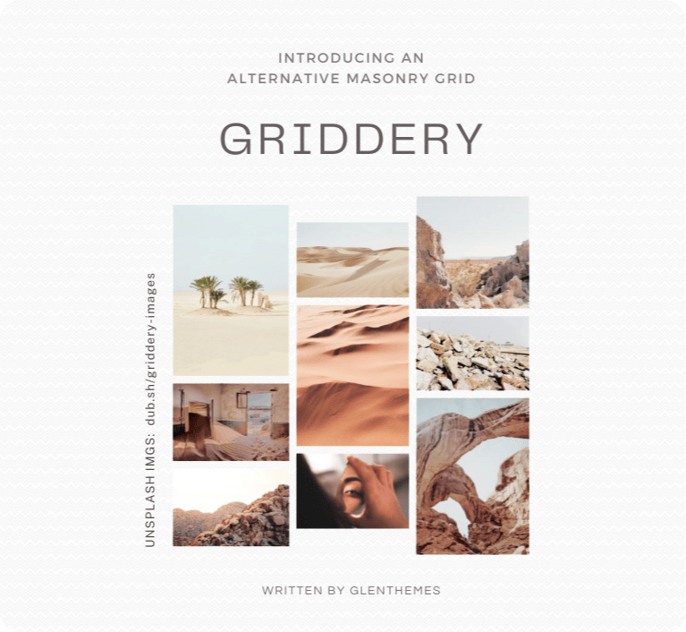
griddery
₊⁺ GRIDDERY ⁺₊
Author: @glenthemes
Version: 4.0
Last updated: 2026-03-03 12:26PM UTC-8
Table of Contents:
- 👋 About
- 👁️ Demo + Preview
- 🚀 How to install
- 🛠️ Options
- ✨ Multiple gridderies
- 📝 Further notes
- 🫶 Credits
- 💖 Attribution
- 🙋 Questions?
👋 About:
Inspired by David DeSandro’s masonry, GRIDDERY is a script that automatically organizes elements of the same selector into a grid without relying on height and position:absolute, instead utilizing nested grids and :nth-child to sort elements into columns while retaining their left-to-right order.
Requirements:
- basic CSS/HTML knowledge
- basic JavaScript syntax knowledge
[!TIP] 🎉 VERSION 4.0 is out now! 🎉
If you are still using the old versions, you do not have to do anything extra; the existing griddery script and stylesheets should still function properly.
If you prefer the old version(s) or still need to support them:
• griddery v1.0 – docs
• griddery v2.0 – docs
• griddery v3.0 – docs
[!IMPORTANT]
If you’re a theme user from Tumblr and are looking to turn your theme from 1 column to e.g. 2 columns, please ask your theme’s maker if it’s okay to do that first.
👁️ Demo + Preview:
jsfiddle.net/glenthemes/axpzvhmb
👉 Expand for demo description.
Firstly, a group of cats (`
🚀 How to install:
1. Add the following under <head> of your HTML:
<!--✻✻✻✻✻✻  griddery by @glenthemes  ✻✻✻✻✻✻-->
<script src="//griddery.github.io/grid.min.js"></script>
<link href="//griddery.github.io/basics.min.css" rel="stylesheet">
<script>
document.addEventListener("DOMContentLoaded", () => {
    gridderyV4({
        items: ".posts", // change this to your grid item's selector
        columns: 2, // number of columns

        // optional responsiveness below:
        responsive: {
            breakpoints: {
                "min-width: 720px": 2,
                "max-width: 720px": 1,
            },
            basedOnGrid: false,
        }
    })
})
</script>
2. Add the following CSS (paste this somewhere between <style> and </style>):
:root {
    --Griddery-Gap: 10px; /* change this to your grid spacing */
}
🛠️ Options:
| Name | Required or optional? | Accepted type(s) | Details |
|---|---|---|---|
container |
optional | • string• single element, e.g. document.querySelector(".container")• multiple elements, e.g. document.querySelectorAll(".container") |
The wrapper for your items; doesn’t have to be the immediate parent. Defaults to body if not specified. |
gridAlign |
optional | string:• "top"• "middle"• "bottom" |
The vertical alignment of your grid items. Defaults to "top" if not specified. |
items |
required | string |
The selector name of what you want to be wrapped; consider this as the “grid item”. |
columns |
required | • number• :root CSS variable(e.g. "var(--Columns)" or "--Columns") |
Number of columns. |
responsive |
optional | object |
🖥️ Must be included if you want to change the number of columns based on screen size. Holds the breakpoints objects within. |
breakpoints |
optional | object |
🖥️ Must be included if you want to change the number of columns based on screen size. Each line is a CSS media query paired with the number of columns you want displayed at said screen size. • e.g. "min-width: 500px": 3 would display 3 columns when the screen is at least 500px wide.• e.g. "max-width:400px": 1 would display 1 column when the screen is at most 400px wide.You can include as many breakpoints as you want. 💡Tip: Start with wide screens e.g. desktop sizes first, then decrease as you go. 💡Tip: For the first breakpoint, I suggest having the same column number as the fixed one assigned in the columns option above. You can see this in my demo. |
basedOnGrid |
optional | true or false |
• true: your breakpoints option’s media queries will be based on the grid’s width rather than the screen width.• false: your breakpoints option’s media queries will be based on the screen width rather than the grid’s width.Useful if you wish to use griddery on a container that doesn’t take up most of the screen width (e.g. an accompanying sidebar exists). |
✨ Multiple gridderies:
Assuming that we want to use griddery as follows:
.postswith 2 columns and a grid spacing of35px.photoswith 3 columns and a grid spacing of10px
We would call gridderyV4() for each instance like so:
gridderyV4({
    items: ".posts",
    columns: 2
})

gridderyV4({
    items: ".photos",
    columns: 3
})
And our grid spacing would be assigned in the CSS like so:
[griddery-id=".posts"]{
    --Griddery-Gap:35px;
}

[griddery-id=".photos"]{
    --Griddery-Gap:10px;
}
☝️ The full selector names go between the quotation marks "" and supports HTML attributes. If your selector name has any # or . or [] or (), please include them.
📝 Further notes:
The above files (i.e. the JavaScript and CSS files) include all past and current versions of griddery. If you only want to include version 4 (the newest version), you can use these files instead:
<script src="//griddery.github.io/v4/grid.min.js"></script>
<link href="//griddery.github.io/v4/basics.min.css" rel="stylesheet">
If you want to perform further actions once the grid has initialized, you can do so like this:
gridderyV4({
    // ... your griddery settings
}, (grid) => {
    grid.classList.add("griddery-done") // or any action that you wish to do
})
If you want to destroy griddery (destroys the griddery layout and reverts all items back to their individual states):
gridderyV4({
    // ... your griddery settings
}, (grid, { destroyGriddery }) => {
    if(/* some condition here */){
        destroyGriddery()
    }
})
🫶 Credits:
Resize Observer polyfill for the responsiveness.
💖 Attribution:
You are welcome to use griddery in both free and commercial projects! In either case, please leave a credit; you can link to this repository or link to my Tumblr post.
🙋 Questions?
Please include your project code and site link!
⊹ Discord: discord.gg/RcMKnwz
⊹ Tumblr: tumblr.com/new/ask/glenthemes
If you found griddery useful, please consider donating!
☕ ko-fi.com/glenthemes